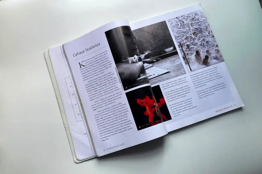
Best Placement for QR Codes in Print Media (Magazines, Newspapers, etc.)
Published on

Location, Location, Location: Where You Put Your QR Code Matters
You've designed a beautiful ad for a magazine and created a perfect, branded QR code to go with it. But where on the page should you put it? The placement of your QR code within a print layout is a critical decision that can significantly impact its visibility and scan rates. Placing it in the wrong spot can cause it to be ignored, or even worse, rendered unscannable. Understanding the best practices for QR code placement in print media is key to maximizing the return on your advertising investment.
This guide will provide you with strategic advice on where to position your QR code in magazines, newspapers, and other print materials to ensure it gets seen and scanned.
The Fundamental Principles of QR Code Placement
Before we get into specifics, there are a few universal principles to keep in mind:
- Visibility: The code must be in a location where the reader's eye will naturally fall. It shouldn't be hidden away.
- Context: It should be placed near the product, offer, or information it relates to. The connection must be obvious.
- Scannability: The placement must allow for a clean, easy scan. This means avoiding folds, curves, and busy backgrounds.
- Clear Call to Action: As always, the code must be accompanied by a clear instruction telling the reader why they should scan it.
Best Placement in Magazines
Magazines offer a high-quality canvas for your ads, but their format has some unique challenges.
DO:
- Place it in a Corner: The bottom-right or top-right corner of an ad is often prime real estate. It’s a natural endpoint for the eye and is usually free from clutter.
- Integrate it into the Main Visual: If you have a large lifestyle image, you can place the QR code within a clean area of the photo (like a clear sky or a plain wall).
- Keep it on a Flat Page: Try to ensure your ad is on a flat page, not on a highly curved section near the binding where the page won't lie flat.
DON'T:
- Place it in the "Gutter": The gutter is the inside margin where the two pages of a magazine are bound together. A QR code placed here will be impossible to scan because the pages don't open completely flat. This is the #1 mistake.
- Place it Too Close to the Edge: Keep it away from the absolute edge of the page (the "trim line"), where it could be accidentally cut off during the magazine's production process.
- Put it on a Glossy, High-Glare Spot: While you can't always control this, be mindful that heavy glare from overhead lights on very glossy paper can sometimes interfere with scanning.
Best Placement in Newspapers
Newspapers have their own set of considerations, primarily related to print quality.
DO:
- Make it Larger: Newspaper print is lower resolution, and the paper is more porous, which can cause ink to "bleed" slightly. To compensate, make your QR code larger than you would in a magazine to ensure the modules are distinct.
- Use a Simple Code: Because of potential ink bleed, a less "dense" QR code (one with less data, like from a shortened URL) will be more reliable.
- Surround it with White Space: The "quiet zone" is even more important in a newspaper. A generous border will help the code stand out from the surrounding text and images.
DON'T:
- Use a Complex, Colorful Design: While branding is great, for a newspaper, a simple, high-contrast black-and-white QR code is often the most reliable choice due to the lower print fidelity.
Best Placement on Posters and Flyers
For posters and flyers, the key is to consider the viewing environment and distance.
DO:
- Place it at Eye Level: For posters, position the QR code where someone can comfortably stand and scan it without having to crouch down or reach up high.
- Make it Prominent: It should be a key element of the design, not a tiny afterthought in the corner.
- Connect it to the Main Message: Place the code directly next to the call to action it corresponds with (e.g., next to the text "Scan to Buy Tickets").
A Quick Reference Table for Placement
| Print Medium | Best Placement Strategy | Key Pitfall to Avoid |
|---|---|---|
| Magazines | Corners of the ad (bottom-right is ideal), with a generous quiet zone. | Placing the code in the center "gutter" or fold. |
| Newspapers | Larger size, surrounded by ample white space, simple black & white design. | Making the code too small or complex for the low-res print. |
| Posters | At a comfortable eye-level, large enough to be scanned from a distance. | Placing it too low or too high, making it awkward to scan. |
| Flyers | Clearly associated with a specific offer or action, with a strong CTA. | Hiding it in a sea of text with no clear purpose. |
Conclusion: Placement is as Important as Design
The success of your print-based QR code campaign depends on a trinity of factors: a compelling offer, a well-designed code, and strategic placement. By understanding the nuances of QR code placement in print media, you can ensure your code is not just present, but prominent, scannable, and effective. A well-placed code invites interaction and successfully bridges the gap between your physical ad and your digital call to action.
Remember to always use a high-quality vector (SVG) file from a generator like QRDesigner.com to give your printer the best possible source file for a clear, sharp result.
