How to Customize Your QR Code's Colors to Match Your Brand
Published on
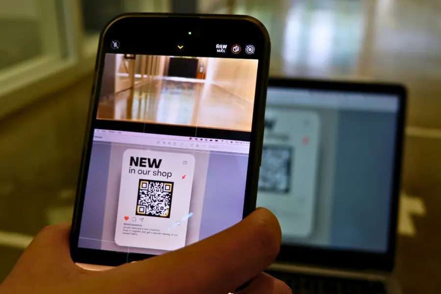
Beyond Black and White: The Power of a Branded QR Code
A standard black-and-white QR code is functional, but is it memorable? In a visually crowded world, branding is everything. Customizing your QR code with your brand’s colors is a simple yet powerful way to increase brand recognition, build trust, and encourage more scans. Learning how to customize your QR code’s colors transforms it from a generic utility into a sophisticated marketing asset that seamlessly integrates with your design aesthetic.
However, adding color isn't as simple as just picking your favorite shades. To ensure your code remains scannable, you must pay close attention to contrast. This guide will walk you through the process of choosing and applying colors correctly, ensuring your QR code is both beautiful and functional.
Why Bother Customizing QR Code Colors?
You might wonder if changing the color is worth the effort. The answer is a resounding yes. Here’s why:
- Increased Brand Recognition: Using your brand’s color palette reinforces your visual identity. When people see the code, they will associate it with your brand even before they scan it.
- Higher Scan Rates: Studies have shown that customized, colorful QR codes are more visually appealing and can attract up to 50-200% more scans than their plain black-and-white counterparts.
- Builds Trust: A professionally branded QR code looks more trustworthy and legitimate than a generic one, reducing user hesitation.
- Seamless Design Integration: A colored QR code can be integrated beautifully into your marketing materials—flyers, packaging, posters—without disrupting the overall design.
The Golden Rule of Coloring QR Codes: Contrast is King
Before you start, you must understand the most critical rule: there must be sufficient contrast between the foreground (the modules) and the background of the QR code.
QR code scanners work by distinguishing between the light and dark squares. If the colors are too similar (e.g., light grey on a white background, or navy blue on a black background), the scanner’s camera won’t be able to differentiate the pattern, and the code will fail to scan. Always follow these two principles:
- The foreground color must be significantly darker than the background color.
- Avoid using very light colors like yellow, pale pink, or light blue for the foreground, as they often lack the necessary contrast against a white or light background.
How to Customize Your QR Code’s Colors: A Step-by-Step Guide
Let's walk through the process using the easy-to-use color customization tools at QRDesigner.com.
Step 1: Create Your Base QR Code
First, generate the QR code for your desired content (URL, Text, Wi-Fi, etc.) on the QRDesigner.com main generator page.
Step 2: Navigate to the "Customize" Tab
Once your code is generated, click on the "Customize" tab. Here you will find the options for changing the appearance of your code, including the color pickers.
Step 3: Select Your Colors
You will see two primary options:
- QR Code Color (Foreground): This is the color of the dark squares in your code. Click on the color swatch to open the color picker. You can select a color visually or, for perfect brand matching, enter the specific HEX code for your brand’s color (e.g., `#DA291C` for Coca-Cola red). Choose a strong, dark color.
- Background Color: This is the color of the light squares and the quiet zone. Again, click the color swatch to choose. It is highly recommended to stick with a white or very light pastel background to ensure maximum contrast and scannability.
As you select your colors, the QR code preview on the right will update instantly, giving you a live view of your design.
Step 4: Test, Test, and Test Again
This is the most crucial step. After you have chosen your colors and downloaded the code, you must test it thoroughly. Scan it with multiple devices (iPhone, Android) and with different QR scanner apps if possible. Test it in different lighting conditions. If it scans quickly and reliably every time, your color combination is a success.
Best Practices for Coloring QR Codes
| Do | Don't |
|---|---|
| Use a dark color for the foreground and a light color for the background. | Use inverted colors (e.g., a light foreground on a dark background). Many scanners cannot read these. |
| Use your primary brand color for the foreground for strong branding. | Use colors that are too similar in tone or brightness (e.g., medium blue on medium green). |
| Use a HEX code for precise color matching. | Use a busy or patterned background image. This will confuse the scanner. |
| Test the code extensively before printing. | Assume that because it looks good, it will scan well. Always verify. |
Conclusion: Make Your QR Code Work for Your Brand
Learning how to customize your QR code's colors is a simple skill that can pay huge dividends in brand consistency and user engagement. By moving beyond the standard black and white, you create a marketing tool that is not only functional but also a true reflection of your brand’s identity. The key is to always prioritize scannability by maintaining strong contrast.
A well-designed, branded QR code is an invitation, not just a utility. It draws the eye, builds trust, and encourages the scan that connects your audience to your world.
Ready to create a QR code that pops? Visit QRDesigner.com, head to our "Customize" tab, and start creating a beautiful, on-brand QR code that gets noticed.